1. Introduction: The Myth of the Universal Rainbow
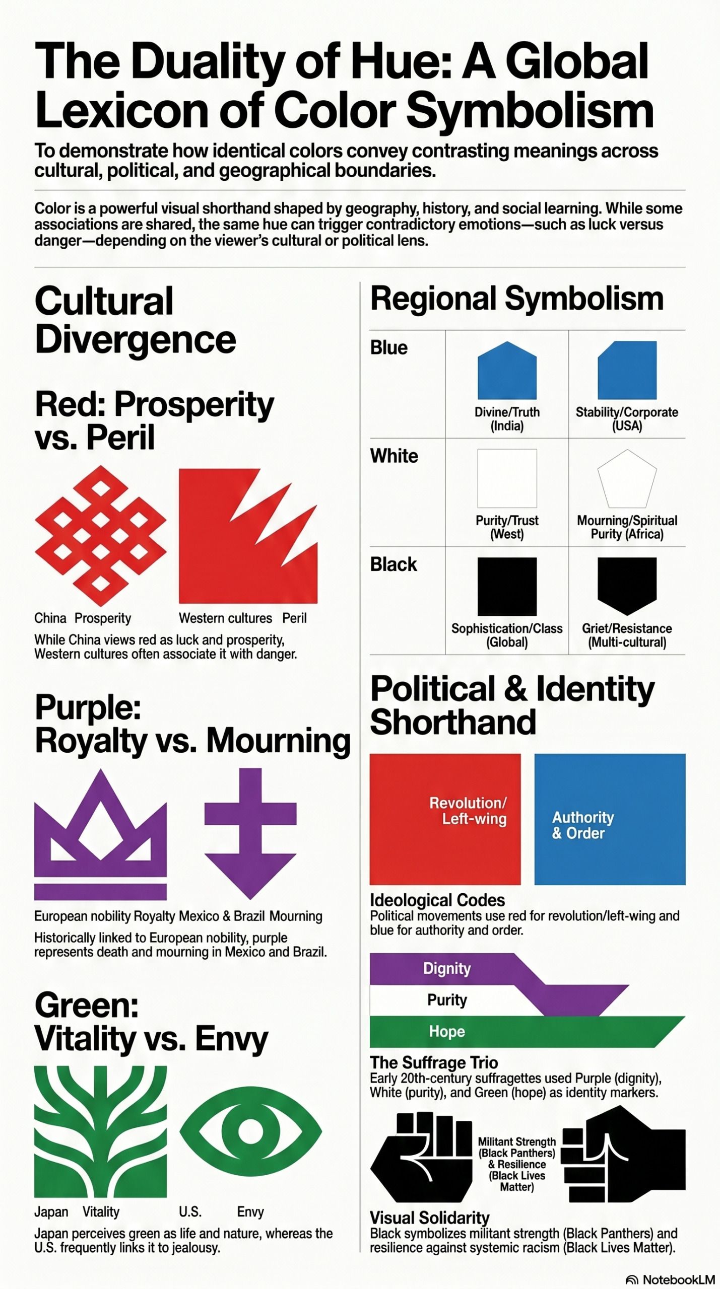
Imagine walking into a wedding in China dressed in vibrant red and being celebrated as a harbinger of luck—then boarding a flight to Germany or Chad, where that same hue might suggest you’ve invited misfortune into the room.
We often move through the world assuming color is a universal language. We believe green automatically means nature, blue means trust, and red means stop. Yet colors are not merely visual data. They are chromatic codes forged by geography, economics, religion, and the raw requirements of survival.
What appears to be a simple aesthetic preference is often centuries of cultural memory compressed into a visual shorthand. Every color carries a story, and every civilization leaves fingerprints on the palette it passes to the next generation.
2. The “Green Desert”: Why Your Perception of Nature Might Be Biased
For many Westerners, a sprawling forest symbolizes ecological health and abundance. Yet that perception is largely a product of temperate geography. In forest-rich regions, green represents life and prosperity. In desert cultures, however, green often signifies something entirely different: a carefully managed resource made possible through irrigation and human effort.
This divergence extends beyond climate. In some cultures, green has historically been linked to danger, death, or caution. Even modern environmentalism reveals this contradiction through the concept of the “green desert”—industrial tree plantations that appear lush from a distance but contain very little biodiversity.
Reflection and Analysis
The universal association of green with life is largely a modern construction. Historically, green often carried darker meanings. Shakespeare immortalized jealousy through the phrase “the green-eyed monster,” linking the hue to envy and greed.
Modern branding has worked relentlessly to redefine green as the color of health, sustainability, and environmental responsibility. When consumers see a green logo today, they are often responding to decades of strategic visual conditioning that has gradually overwritten older associations.
Green did not naturally become the color of wellness. It was carefully repositioned into that role.
3. From Sea Snails to Sovereignty: The High Cost of Being Purple
If geography shaped green, economics shaped purple.
For more than 2,500 years, purple served as one of history’s most exclusive status symbols. Producing purple dye required enormous labor and resources, often extracted from thousands of sea snails to create only small quantities of pigment.
As a result, purple became a visual barrier between rulers and the ruled.
Historically, it was one of the most expensive and difficult colors to produce, which is why it became closely associated with royalty, wealth, and political authority.
Reflection and Analysis
Purple represents one of history’s greatest examples of a scarcity signal.
Because ordinary people could not afford it, the color became shorthand for sovereignty, prestige, imagination, and power. Even though synthetic dyes eliminated this scarcity long ago, the psychological association remains intact.
Modern brands continue to leverage this ancient cultural memory. Purple communicates uniqueness, creativity, and premium positioning because our brains still carry echoes of the economic realities that created the color’s status thousands of years ago.
4. The Red Paradox: Luck, Love, and Misfortune
Few colors generate stronger emotional responses than red.
In China and India, red symbolizes prosperity, celebration, good fortune, and marriage. Yet in parts of Germany, Chad, and Nigeria, the same color has historically been linked to danger, bad luck, or warning.
Red simultaneously represents love and war, passion and aggression, life and death.
Reflection and Analysis
This contradiction reveals the constant tension between biology and culture.
Biologically, red attracts attention. It raises heart rate, stimulates appetite, and increases physiological arousal. This is one reason fast-food companies frequently rely on red within their branding.
Yet biology alone cannot determine meaning.
A marketer may use red to signal excitement, but if the target audience associates the color with danger or misfortune, the cultural narrative can overpower the biological response. Our hearts may react instinctively, but our upbringing ultimately determines whether we interpret that reaction as excitement, celebration, caution, or fear.
5. The Blue Zone Effect: Why Coastal Living Changes Your Psychology
Blue consistently ranks as the world’s most popular color.
This preference is not accidental. Throughout history, the sky and the sea represented survival. Coastal civilizations depended upon water for food, trade, transportation, and protection. Over time, blue became associated with stability, safety, and divine favor.
Ancient cultures reflected this reverence through religious symbolism, sacred art, protective amulets, and depictions of gods connected to water and the heavens.
Today, the relationship continues through concepts such as Blue Zones—regions like Okinawa and Ikaria, where coastal lifestyles are associated with exceptional longevity.
Reflection and Analysis
The calming effect many people experience near water is not merely poetic; it may be rooted in thousands of years of evolutionary conditioning.
Water meant survival.
As a result, blue became linked to truth, security, reliability, and peace. Modern banks, insurance companies, healthcare organizations, and technology firms routinely use blue because they are attempting to borrow that ancient sense of safety.
In many ways, corporate blue branding is simply a modern adaptation of humanity’s oldest survival instincts.
6. Chromatic Codes: How Political and Social Movements Use Color as Shorthand
Color becomes even more powerful when attached to collective identity.
Throughout history, social and political movements have used color as a strategic force multiplier, creating instant recognition and unity across language barriers.
Examples include:
- The Suffragettes, who used Purple for dignity, White for purity, and Green for hope.
- The Black Panther Party, which leveraged the authority and strength associated with black.
- The 2017 Women’s March, which transformed pink into a symbol of solidarity and collective action.
Reflection and Analysis
Color functions as a visual shortcut.
In a crowded digital landscape or a chaotic public demonstration, a single color can instantly communicate identity, values, and affiliation.
Unlike written language, color requires no translation. It creates belonging in seconds and allows individuals to signal membership in a larger community without speaking a word.
This ability to bypass language makes color one of the most powerful communication tools ever developed.
7. Yellow and the Serotonin Shortcut
Yellow is among the most visible colors to the human eye.
Its brightness naturally attracts attention, making it ideal for warning signs, school buses, taxis, safety equipment, and high-visibility branding.
Many companies use yellow to create feelings of optimism, energy, friendliness, and accessibility.
Reflection and Analysis
However, yellow also demonstrates the limitations of emotional branding.
In various cultures, yellow has been associated with cowardice, impulsiveness, instability, and excessive criticism. The same color capable of generating positivity can also trigger skepticism.
This duality reminds us that no color possesses a fixed meaning. Every hue exists within a cultural framework that shapes how it is interpreted.
A yellow logo may capture attention instantly, but attention alone does not guarantee trust.
8. The Globalization Twist: Is the Internet Killing Local Color?
For thousands of years, colors evolved within local cultures and carried highly specific meanings.
Today, globalization is changing that reality.
Social media platforms, multinational corporations, and global advertising campaigns increasingly promote a standardized visual language. Blue means trust. Green means sustainability. Red means urgency. Purple means creativity.
As these associations spread across the world, local color traditions risk being overshadowed.
Reflection and Analysis
We are witnessing a cultural tug-of-war between local history and global branding.
A universal color language makes communication easier across borders, but it also risks erasing the unique chromatic fingerprints that once distinguished one civilization from another.
The question is no longer whether color influences culture.
The question is whether global culture is beginning to standardize color itself.
9. Conclusion: The Fingerprints of Civilization
Colors are far more than decorative choices.
They are historical artifacts, survival tools, cultural symbols, economic signals, and psychological triggers all wrapped into a single visual experience.
From Shakespeare’s green-eyed monster to the Blue Zones of coastal longevity, every color carries traces of the fears, aspirations, values, and survival strategies of the people who came before us.
The next time you notice the blue glow of a screen, the green of a park, or the red of a warning sign, remember that you are not simply seeing a color.
You are reading a living historical record.
And whether you realize it or not, that record is still shaping how you think, feel, and interpret the world around you.